Thursday, 27 September 2012
Wednesday, 26 September 2012
FRANCESSCA WOODMAN


STEVEN KLEIN


Although Steven Klein's work may seem quite harsh, sharp and maybe innappropiate to some vieweres I found that it made me think into each image so much as to why that has been photographed and the story behind it. I also found that out of all the photographers that we were shown Klein's name was the one I remembered straight due to the fact that his work has that memorable effect on you. I also love that fact that he's one of those artists who bring in an emotional and abrupt side to art which make it more interesting and captivating compared to a typical drawing or painting.
PHOTOGRAPHY - EDWARD MUYBRIDGE

Reflection on illustration.
Although initially illustration has never appealed to me I was surprised by how much I enjoyed the tasks we were set. I found myself being more experimental with equipment I used when drawing and understood the art work actually looks more effective when it is a bit more careless and messy. It also taught me to look at objects in different ways as I had to do thumbnails of different parts of birds to create my final illustration piece as shown below. 

DAVID HOCKNEY
An illustrator which I found and had an interest in his work was hockey, it immediately appealed to me that he used his own personal aspects of life such as his mother's face and incorporated it into his collage art pieces making the face distorted but still visible. Therefore I had so many ways in which I could interpret his work such as the example I have posted which is a cut up and collaged image of my nephews face. I feel this makes art more meaningful and direct to the artist in which it should be. 

Illustration- SARA FANELLI
Out of all the illustrators which I researched Sara Fannelli's work definitely appealed to me the most due to the fact that her pieces are quite gentle and subtle because of the soft colours that she uses however because of the business and child like images on the work it still grabs your attention. 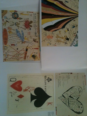
Subscribe to:
Posts (Atom)