Monday 12 November 2012

Textiles

Loved all the freedom and creativity we were allowed to use during Textiles! Found myself exploring different techniques and materials and really liking the outcome!

Fashion

During Fashion we were asked to use different papers and materials to create garments or parts of garments on to mannequins. This was a really fun and creative way of being more active and getting stuck directly into what you would actually be doing if you were to pick Fashion.

Textiles


I really enjoy sampiling from Michael Brennand Wood's work as I've studied Textiles a lot before therefore I have a lot of experience in textiles techniques such as sewing and using a range of embellishment techniques, therefore I feel it is really fun to sample his work as you can get away with just using recycled materials to replicate his work effectivley!

Tuesday 16 October 2012

Thomas Heatherwick


The obvious attraction to Heatherwick's work is the use of layers and overlapping of the materials. This makes the piece's more abstact and complex, it also requires you to look more closley at the object in order to identify all the different shapes and colours used.

Applied Arts

Applied Arts wasn't what I expected it to be like as I didn't realise we would be doing activities such as the metal work. Enjoyed the freedom we had to explore the different machines to create the cubes! However after a while I did find myself repeating techniques to often and therefore just filling space on the cube for the sake of it.

Wednesday 26 September 2012

FRANCESSCA WOODMAN


Again like Sten Kelin's work I was drawn to Francessca's photographs because of the intensity and abruptness of the photos. All the images are open to your own interpreation but with every photo I look at of her's I get this ghostly dark feeling that the image is about pain and sadness. Although this isn's the nicest way to approach art it is extremely interesting and moving to me and an artists feelings and thoughts can be so easily interpreated by a photograph.

STEVEN KLEIN


Although Steven Klein's work may seem quite harsh, sharp and maybe innappropiate to some vieweres I found that it made me think into each image so much as to why that has been photographed and the story behind it. I also found that out of all the photographers that we were shown Klein's name was the one I remembered straight due to the fact that his work has that memorable effect on you. I also love that fact that he's one of those artists who bring in an emotional and abrupt side to art which make it more interesting and captivating compared to a typical drawing or painting. 

PHOTOGRAPHY - EDWARD MUYBRIDGE

I was drawn to how different Muybridge's work is compared to other photographers as he tends to make his pieces more complex by doing screen shots of lots of images and incorporating it into one piece, however because the majority of his work all remains to be black and white this doesn't appear to be tou busy and overwhelming for the viewers. In particular I like the image above because I find it amazing how the sequence of one movement can be so effective and look so sharp.

Reflection on illustration.

Although initially illustration has never appealed to me I was surprised by how much I enjoyed the tasks we were set. I found myself being more experimental with equipment I used when drawing and understood the art work actually looks more effective when it is a bit more careless and messy. It also taught me to look at objects in different ways as I had to do thumbnails of different parts of birds to create my final illustration piece as shown below.

DAVID HOCKNEY

An illustrator which I found and had an interest in his work was hockey, it immediately appealed to me that he used his own personal aspects of life such as his mother's face and incorporated it into his collage art pieces making the face distorted but still visible. Therefore I had so many ways in which I could interpret his work such as the example I have posted which is a cut up and collaged image of my nephews face. I feel this makes art more meaningful and direct to the artist in which it should be.

Illustration- SARA FANELLI

Out of all the illustrators which I researched Sara Fannelli's work definitely appealed to me the most due to the fact that her pieces are quite gentle and subtle because of the soft colours that she uses however because of the business and child like images on the work it still grabs your attention.

Tuesday 25 September 2012

THOMAS FINCH
What I like about Thomas Finch's work was the fact that only images of symbols have been used and you can easily guess or make your own interpretation of what the art piece is trying to get across making the point of the work easy to understand or open to your own interpretation.

ADITH TIRTA
The main reason that Adith Tirta's work caught my attention was because of her use of backgrounds on her pieces it makes the image at the front looks more sharp and fierce and the colours also creates a sort of frame for the main picture.

EBON HEATHI was drawn to Ebon Heaths work from her effective use of perseption and creativity as to the sizing and spacing of the letters. Also when I found out that she uses cut up letters and forms the shapes from her favourite quotes and lyrics it made the art piece that bit more interesting.
NOMA BAR
PEP CARRIO
ALAN FLETCHER
This is definitley one of my favourite graphic pieces from Alan Fletcher mainly because of the suprise as I didn't initially realise that the image help hundreds of pencils till I looked closley, therefore that element of suprise makes the piece more interesting. I was also really drawn to the stpry behind the piece being that everytime Alan borrowed a pencil of someone everywhere he went he would save it until he had a collection big enough to create this. So simple yet so effective!

WIM CROUWELL
Although Crouwell's work isn't an imediate favourite of mine I do admire his capability of combining the right colours together so his work pieces arn't too busy and overpowering but blend together yet still have an effect on you. Such as the image above which is simply Black and White yet still grabs your attention by the font and spacing of the page.

STEFAN SAGMEISTERI was really inspired by the meaning behind each piece of Sagmeisters work such as the picture above which has words etched into his own body explaining things he has to do and personal factors of his life. This also has a much bigger influence on you compared to something just being created on paper or on a computer.

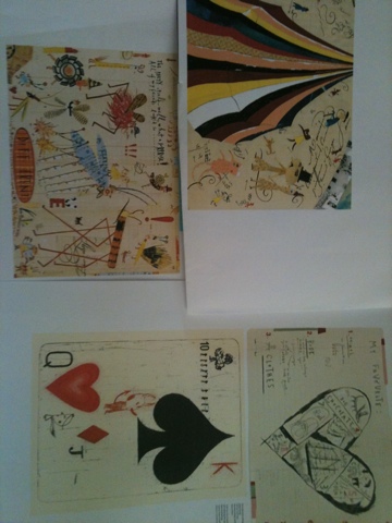
The piece of artwork above was created using a range of different scrap papers, chalks, inks and different coloured pens and pencils. The task was to create a different collage on each square by copying a piece of text off everyday items such as food items, tins and posters.